Warm & Sophisticated Branding Suite
Branding for a speech therapist
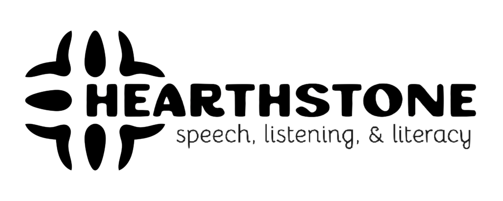
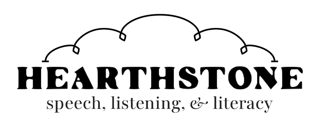
Speech therapist Rachel reached out to me last summer about designing a new logo for her speech language pathology private practice. Hearthstone Speech, Listening, and Literacy was a labor of love, and she wanted her logo to reflect the feeling behind her practice’s name: the interconnectedness of a single stone surrounded by a community of anchoring stones.
Right from the get-go, I loved Rachel’s inspiration and ideas for a new logo – which included florals, Mexican tile motifs, and ties to Greek mythology. She also emphasized that her new branding should feel sophisticated, reflecting the “boutique” nature of her practice, but still warm and personable.
Assembling a branding moodboard
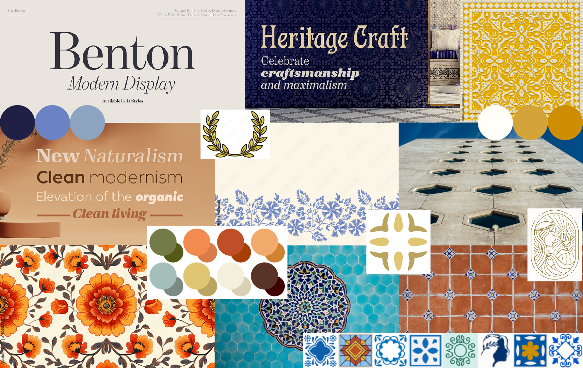
The first step in creating Rachel’s new branding suite was to assemble a moodboard to guide the design. I typically like to start all my branding projects by sending my clients a moodboard based on the inspiration we discussed during our consult. Not only does it help me brainstorm about the themes, art styles, and colors I want to reflect in the final product – it also ensures that we’re on the same page before I start any time-consuming design work!
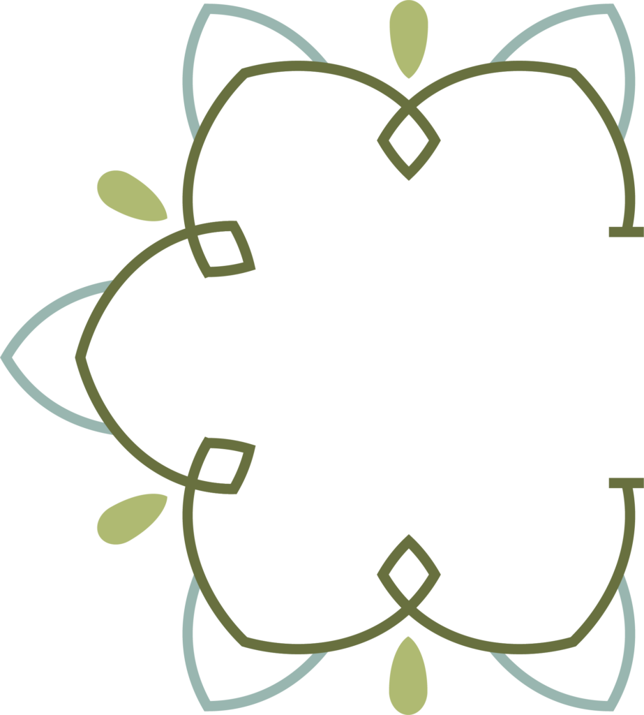
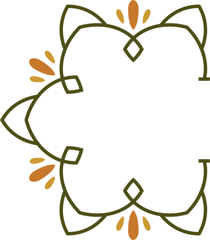
In Rachel’s case, because she had strong inspiration but no clear vision for her logo, I had some room to explore the ideas I thought would best convey her brand. I was drawn to patterns of repeating symmetry, and motifs inspired by bright Mexican florals and Mediterranean tiles – both of which were meaningful to her and tied into the origin of her practice’s name.
Mocking up some logo options
Rachel confirmed that the moodboard nailed her vision – so the next step was for me to design the first round of logo mockups. My process for designing a client’s branding suite is all about collaborating and refining ideas. I like to start broad, with some rough design concepts in different art styles that represent potential “directions” we could take the client’s branding. Then their feedback helps me narrow down those options and continue refining whichever direction we land on.
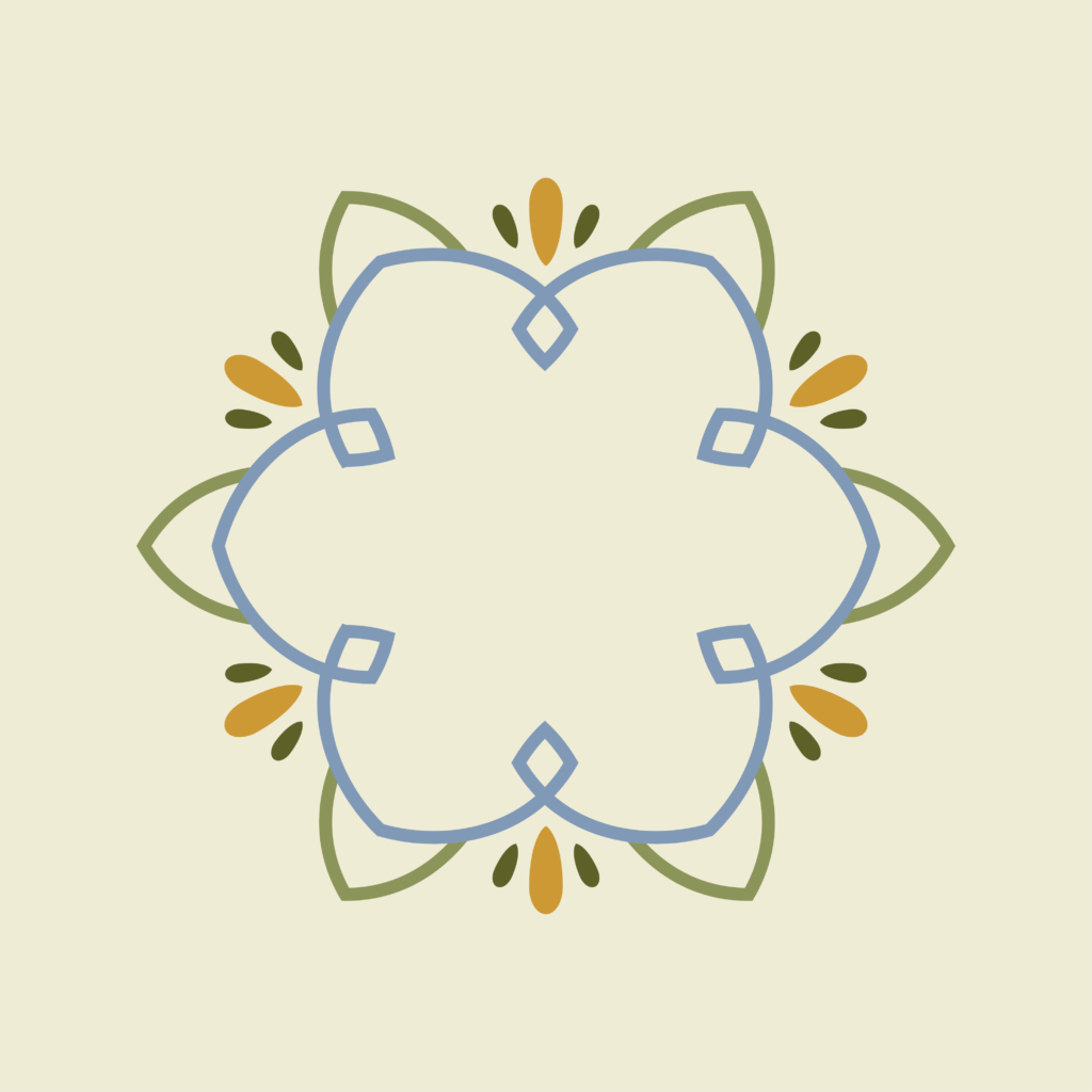
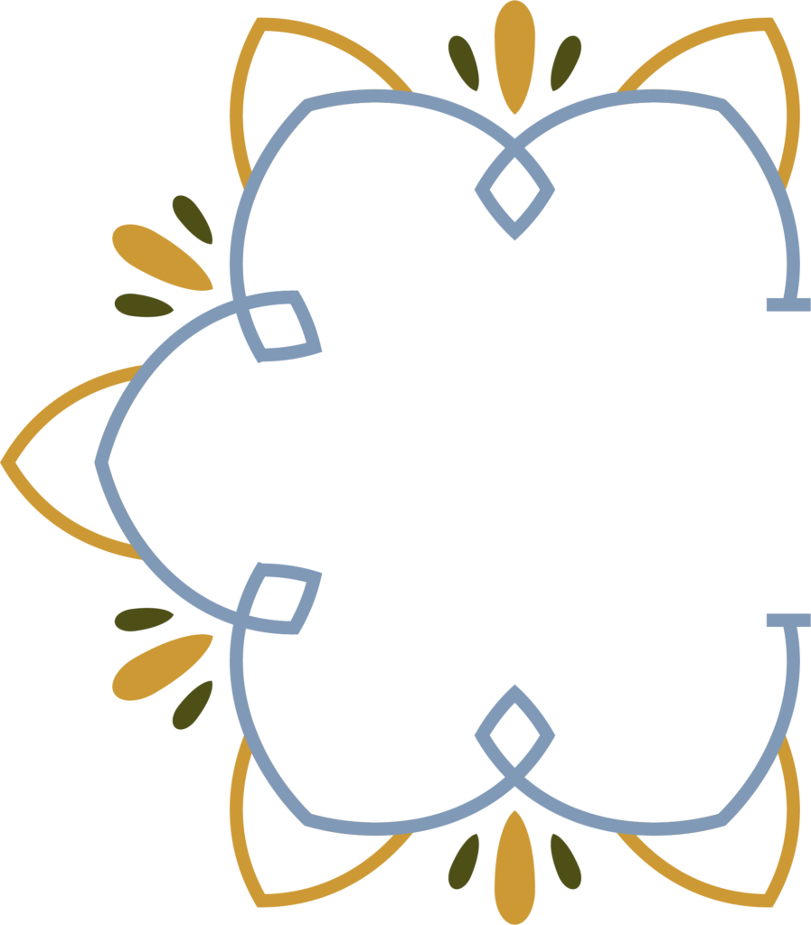
The two design concepts that Rachel was most drawn to both evoked the style and symmetry of Mediterranean tiles, with shapes and lines that were geometric but soft.
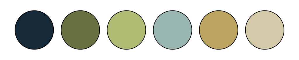
This is also the stage where I typically offer a range of font and color palette choices, once again starting broad with varied styles, and tweaking or providing more options based on a client’s feedback.
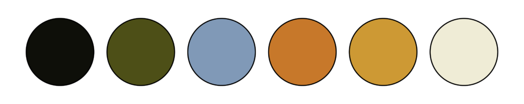
In Rachel’s case, we were aiming for a colorful but muted palette, so I pulled hearth-inspired yellows and terracottas, warm natural greens, and soft blues. As far as fonts, Rachel wanted a bold – but not boring – primary font, so I searched independent foundries for strong, slightly organic, and highly readable font options.
Refining our design concepts
I used Rachel’s notes about the artwork, fonts, and colors she liked most to combine some of the best elements of each. Our next round of mockups was much narrower, applying potential color palettes to a few design options. Rachel liked the more intricate details in these options, and noted a few specific colors she’d like to see reflected in the final branding suite.
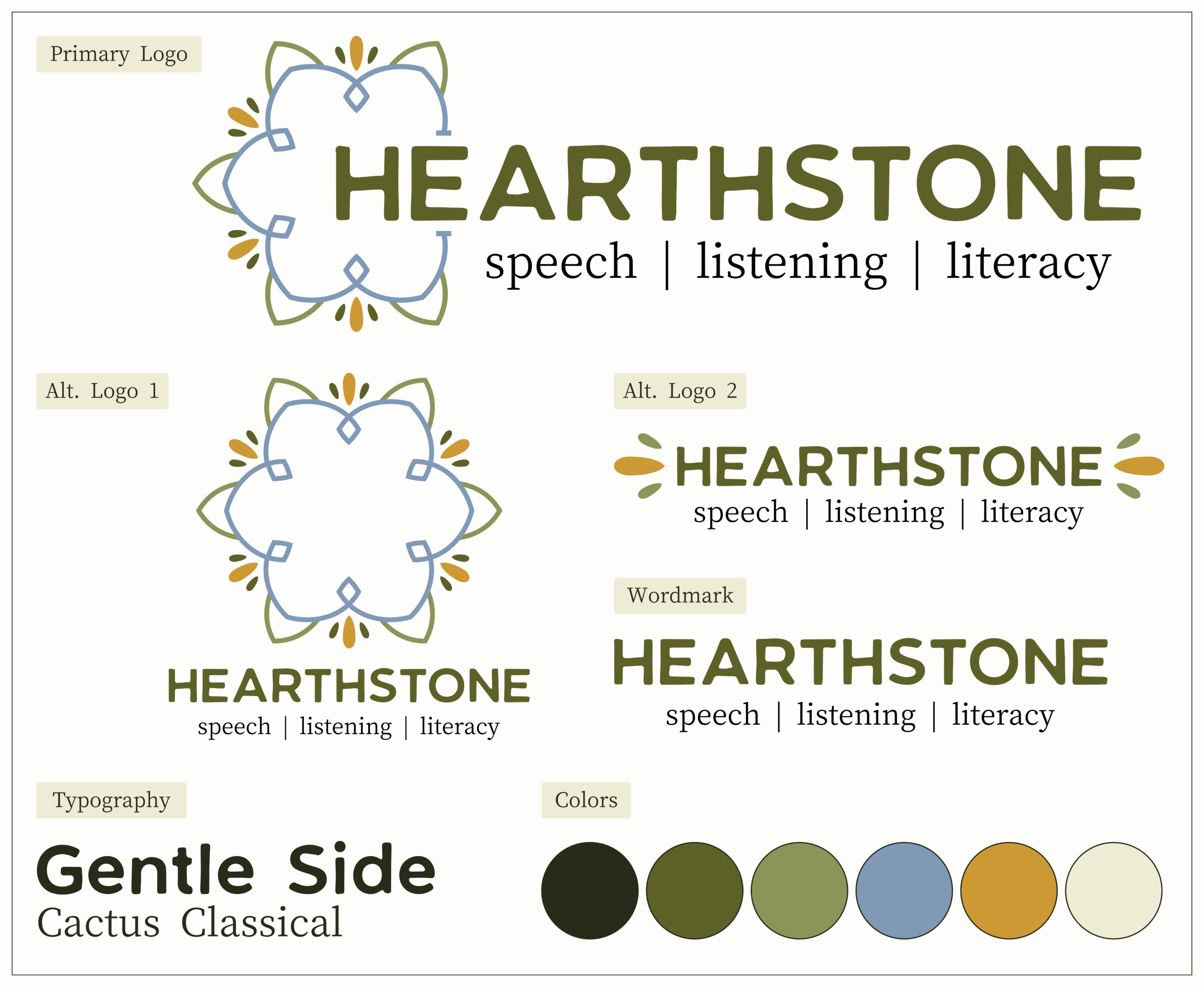
Putting together a branding suite
With Rachel’s feedback in mind, I started putting together her full branding suite. Her custom package included logo variations that would work across her website, social media, and letterhead, as well as licensing of two fonts for desktop and web use.
I create a custom branding package for each client based on what your individual business needs. If you sell physical products, I’ll make sure to design a logo variation that’s just the right size and looks great printed. If you’re heavy on social media marketing, I can include icons for story highlights, so your profile is polished and perfectly on-brand.
And no matter what, your branding will be yours – with original artwork and a package of ready-to-use files that will never, ever run you into copyright trouble.
Delivering warm + sophisticated branding
Rachel’s final file package included image and vector files for all her artwork and logo variations, as well as font files she could upload to her website to make all her clients’ interactions with her practice feel professional and cohesive.
Hearthstone’s new branding was perfectly aligned with its practice: inviting, sophisticated, and rooted in history and community. I was so pleased to deliver this suite of polished logos, warm colors, and strong, classic typography for Rachel’s business.
Whether you’ve got logo ideas that just need a designer’s refining, or no clue where to start with branding, I’d love to help you craft a sophisticated brand that tells clients exactly the right thing about your business (and by extension, you)!